closer to the bone
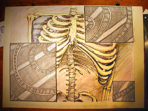
Ink and pencil on paper.
18" x 24"
SUBJECT: Using a split-image format, based on the Golden section, create a juxtaposition (visual and conceptual) by drawing 2 parallel images - one a description of part of a human skeleton, and one image is selected from another context. Consider the comparison and contrast of the elements - analogy, metaphor, symbols, etc.
CRITERIA/MATERIALS: 1 of 2 images may include colour. Tonal structure may be pre- or post-Titian. Variety of chalks, conte, ink, pencil. Minimum 18" x 24".


12 comments:
Coooool. Is that what my insides look like?
I'm going to go with post-Titian, as the titians have been removed.
Really interesting piece. Did you base the square panels on ethnographic prints from Aboriginal Australians? Cause that what it kinda looks like to me.
Keep up da funky work Poops!
Holy freaking crap... you did that shmoops?
Your best yet!!! WHOO HOO!!!
I love this!! Very cool...
hedy: mmmmmmmmmebbe...
squid: yer wife's got a great set of titians.
rich: you are spot on! i've always really admired the intuitive, narrative and graphic qualities of the work of aboriginal australians. i also recently visited this exhibit at the textile museum of canada. i combined those inspirations with some other pattern ideas i've been working on in my sketchbook.
rich: the idea was to refer to the ribcage in an abstracted way.
dave: thanks!!!
jlee: thanks!
i really really dig this. good work. hi poopee and thanks for yer support.
Post a Comment